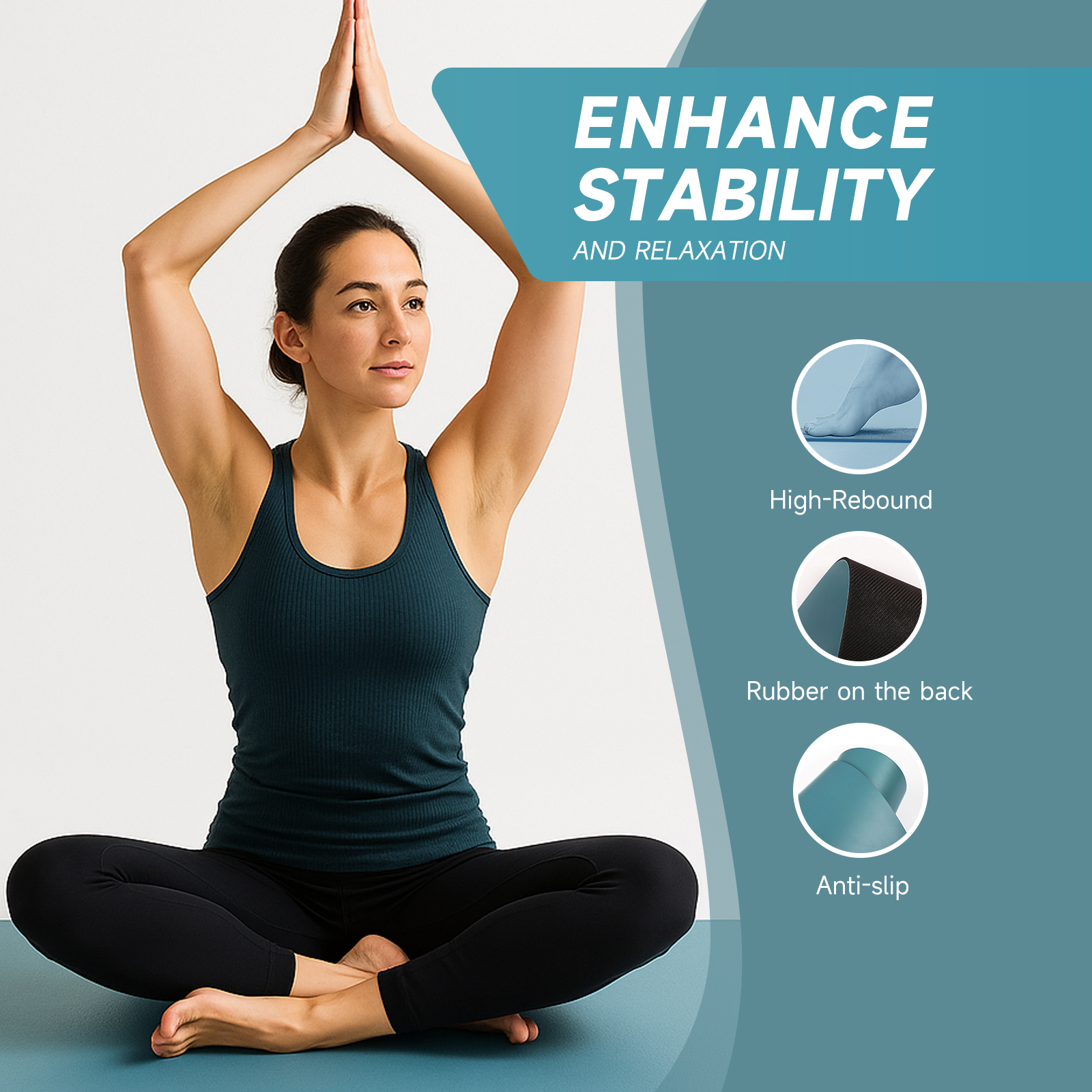
A yellow yoga mat is not a stock colour at Printing Yoga, and it is better to hear that before you plan a range around one. None of our solid-colour decks is listed as yellow. The closest stock neighbours are Vibrant Orange (#EE7033) on the PU + Rubber mat at 185*68*0.45cm, the Natural Wood Color (#DBB17E) of our Cork + Rubber mat at 183*66*0.4cm, and MilkTea Color (#9A9784) for buyers who really want a warm neutral. A true lemon, sunflower or mustard is a custom production request, made either as a single colour or as printed artwork, and approved on a physical sample.
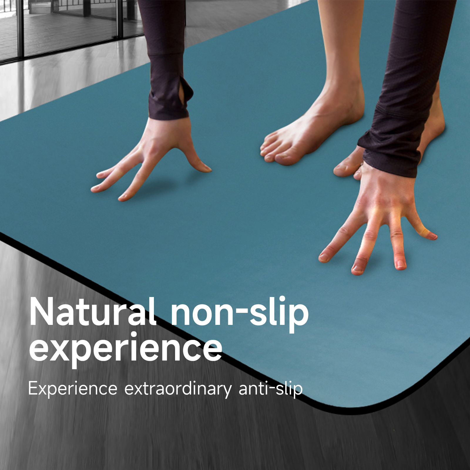
What "yellow" actually covers on a colour card
Buyers who ask for yellow usually mean one of three different things. Some want a bright, sunny tone that stands out in a product photo. Some want a muted mustard or ochre that sits with earth tones. And some want warmth in general, and would be equally happy with a honey or sand shade. Those three briefs lead to three different answers in manufacturing, so the first job is to work out which one you are holding.
Here is what the stock catalogue offers on the warm side today, with the codes the product pages carry:
- Vibrant Orange (#EE7033) — the only saturated warm tone on the PU + Rubber 185*68*0.45cm mat with laser printed alignment lines. It is clearly orange, not a deep yellow, but it does the same job in a range: the loud, energetic slot.
- Natural Wood Color (#DBB17E) — the face of the Cork + Rubber 183*66*0.4cm mat. This is the nearest thing to a golden tone we stock, and the colour comes from the cork itself, not from pigment.
- MilkTea Color (#9A9784) — a warm grey-beige on the same PU + Rubber deck. It is a neutral, and we would not sell it to you as a yellow, but brands that asked for "something warm and calm" often end up here.
- Mustard Green (#76A9A4) — listed because the name misleads. On the mat it is a soft blue-green. If you searched our catalogue for mustard and landed on this colour, it is not the mustard yellow you had in mind.
Why a pale warm tone is harder to make than a dark one
Yellow is one of the least forgiving colours to hold on a mat surface, for reasons that have nothing to do with taste. It is light, so anything underneath or on top of it shows. A dark base layer can dull it. Dust from a studio floor, the trace a damp hand leaves, and dye from dark leggings are all more visible on a light warm surface than on a charcoal or a deep green. Alignment lines also need a second look: a pale line that reads clearly on a black deck can almost vanish on a light one, so the line tone has to be chosen together with the deck colour, not afterwards.
None of this makes the colour a bad idea. It means the details have to be settled during sampling. Our manufacturing team would rather show you a sample that looks slightly different from your screen and explain why, than promise a match from a hex code and let the bulk order be the first time anyone sees the real thing.
Which route fits your program
- If you need a warm, bright accent in a range this season and do not have time for colour development, take Vibrant Orange from stock. It fills the same slot on a shelf and it is a product we already make to known standards.
- If you want a golden, natural look and your brand story leans on materials, take the cork mat. The Natural Wood Color will not drift the way a mixed pigment can, because nothing was mixed to create it.
- If you need a specific brand yellow — a logo colour, a campaign colour — ask for a custom single colour on the PU + Rubber deck, send a Pantone or hex reference, and plan for a physical sample before bulk.
- If you want yellow as part of a picture — a sunflower, a sunrise gradient, citrus artwork — use the printed route. On our printed PU + Rubber mats the design carries the colour, so one mat can hold several yellows next to other tones.
- If you only need a few yellow mats for one studio, custom production is not the right tool and we will say so. A colour that is not on the stock card needs its own development work, and that only makes sense when the order is large enough to carry it.
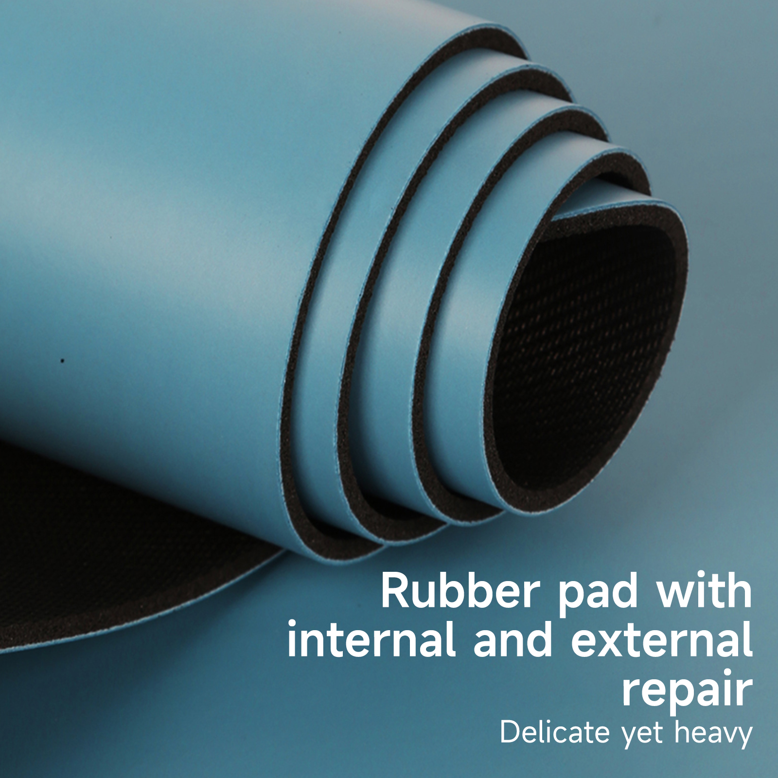
Stock neighbours and custom routes compared
| Option | Material and size | How the colour is made | Stock or custom | Best for |
|---|---|---|---|---|
| Vibrant Orange (#EE7033) | PU + Rubber, 185*68*0.45cm | Solid deck colour, laser printed alignment lines | Stock | A bright warm slot without development time |
| Natural Wood Color (#DBB17E) | Cork + Rubber, 183*66*0.4cm | The cork face itself, no pigment | Stock | Golden, natural-looking ranges |
| MilkTea Color (#9A9784) | PU + Rubber, 185*68*0.45cm | Solid deck colour | Stock | Warm neutrals, calm studio palettes |
| Custom solid yellow | PU + Rubber deck | Colour developed to your reference, confirmed on a sample | Custom | Brand colours that must repeat across orders |
| Yellow inside printed artwork | PU + Rubber, 185*68*0.45cm | Printed design, latex printed alignment lines | Custom artwork | Florals, gradients, seasonal designs |
How to brief a custom yellow so the sample comes back right
The briefs that go smoothly all contain the same four things. First, a reference that is not a screen: a Pantone number, a printed swatch, or a physical product you can post to us. Second, the surface you want it on, because a smooth PU face and a frosted one do not show the same tone the same way; our Frosted PU + Rubber mat is the place to look if you want a softer, less shiny finish. Third, the colour of the alignment lines and logo, so contrast is designed in from the start. Fourth, where the mat will be used. A retail gift set and a busy studio floor ask different things of a light colour.
From there our team can help create the artwork files if you do not have them, make the sample on the real material, and send it for your approval. Packaging, logo placement and delivery dates are confirmed in writing during this stage. If the first sample is not quite right, a second round is normal. It is much cheaper to adjust a sample than to receive a full order of high-quality mats in a shade you cannot use, and we would rather make that point early than during a complaint.
One practical note for brands building wider collections: because we manufacture mats, meditation cushions and apparel products in one place, the same yellow reference can be used across several items. It will not look identical on rubber, suede and fabric, but approving them side by side lets you ensure the set reads as one family.

Frequently asked questions
Do you have a yellow yoga mat in stock?
No. None of our solid-colour mats is listed in that shade today. The nearest warm options are Vibrant Orange on the PU + Rubber deck and the Natural Wood Color of the cork mat. Anything closer to lemon or sunflower is made to order after a sample is approved.
Is Mustard Green a mustard yellow?
No, and the name causes confusion. On our PU + Rubber mat it is a soft blue-green with the code #76A9A4. If your brand palette calls for a real mustard or ochre, treat it as a custom colour and send us a physical reference.
Will a light yellow mat show dirt and sweat marks?
More than a dark deck will. Light warm tones show floor dust, damp handprints and dye transfer from dark clothing sooner. For studio use we usually suggest a deeper, more muted tone or a printed design, where a pattern hides everyday marks better than a flat pale surface.
Can you match our brand colour exactly?
We can get close and we prove it on a sample before bulk production. Send a Pantone reference or a physical swatch instead of a screenshot, tell us which surface you want, and judge the result in your hands. Screens differ too much to be the standard.
Should we choose a solid colour or a printed design?
Choose solid when one exact tone has to repeat across reorders, such as a logo colour. Choose print when the yellow is part of a picture or gradient, or when you want several tones on one mat. Our team can help you decide once we see the artwork.
Is cork a good substitute if we wanted a golden mat?
Often, yes. The cork mat at 183*66*0.4cm has a natural golden-brown face that needs no pigment, so its look is consistent by nature. It suits brands with a natural or eco story. It will not suit a brief that calls for a bright, clean lemon.